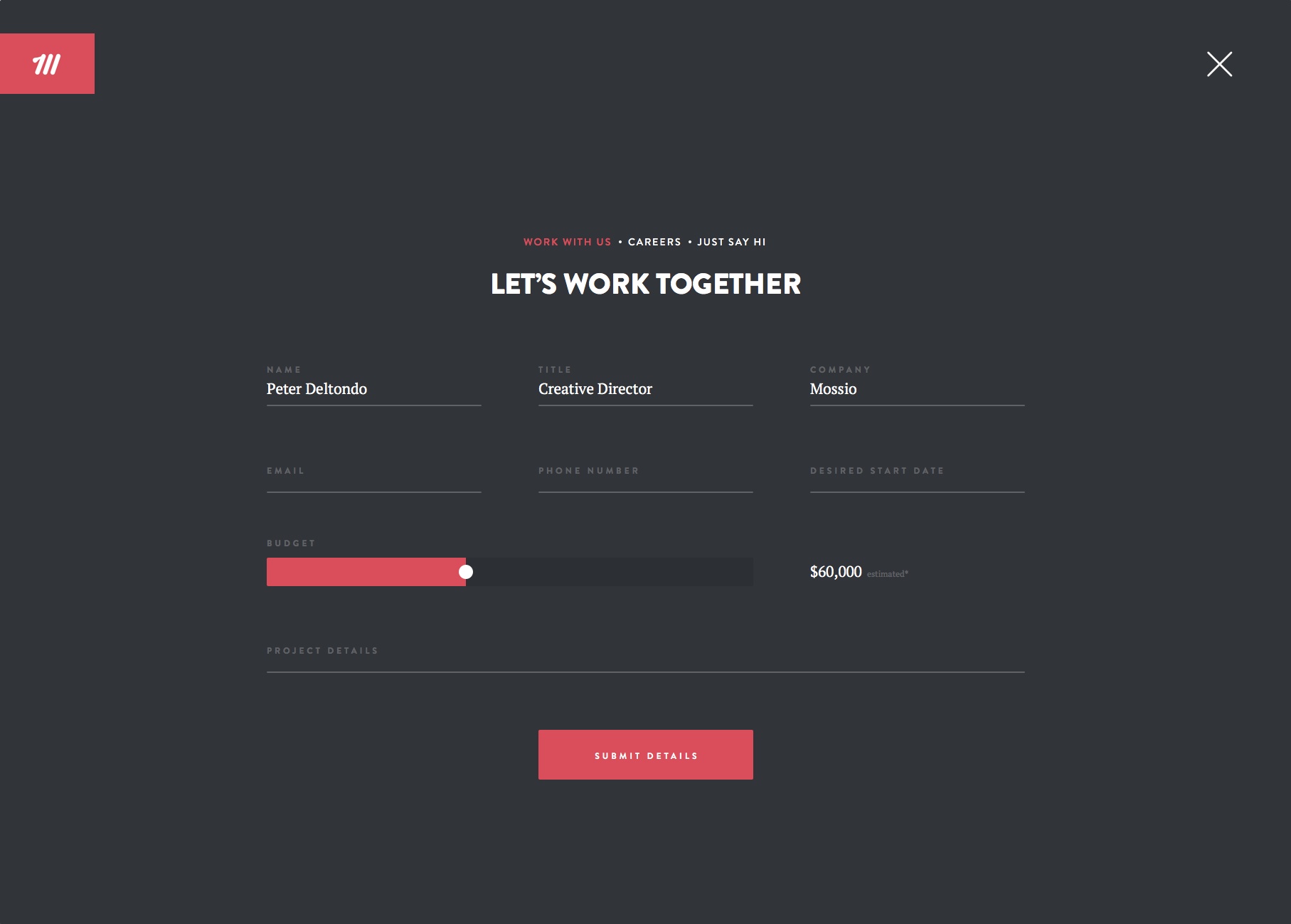
By nature contact forms tend to be simple and straightforward, but because of that people tend to not pay that much attention to their design. As a result there are lots of common mistakes that are made in contact forms that really should be avoided.
In particular the next time you create a website contact form, you should try to avoid these 4 common mistakes:
- Structuring the contact form with multiple columns
Multiple columns are not just unnecessary in a contact form, but they can also make it more complicated and distracting. In contrast single-column forms can be completed more quickly and are more user-friendly.
In short you should always use a single-column design instead of a multiple-column design for your contact forms.
- Adding unnecessary fields to the form
Lots of contact forms tend to contain numerous fields that aren’t really essential to the form. To be honest for most contact forms there are only three fields that are truly essential: The name, email address, and content fields.
Some other fields may help in certain situations however. For example a subject/category field can be useful to help segment the responses from the form.
As far as possible you should try to keep the number of fields as low as possible however, so that it is easier to fill out.
- Unhelpful or generic error messages
The error messages that contact forms display are often overlooked and tend to be unhelpful or generic. That is far from ideal, and will mean that should anyone ever encounter one they may just give up on contacting you entirely.
Try to customize your error messages to make them more helpful. Each error message should clearly identify the problem, and suggest how it can be solved.
- Implementing omplicated CAPTCHA
Although using CAPTCHA is essential in contact forms to avoid spam – if the CAPTCHA itself is too complicated it may reduce the number of people who use the form. Try to make sure the CAPTCHA that you use in your forms is simple and can be completed easily by anyone who isn’t a robot.
For example Google’s reCAPTCHA is currently arguably one of the easiest yet effective types of CAPTCHA to use.
By avoiding these mistakes, it should be far easier to use your contact forms. As you can see however there are numerous improvements that you may need to make, which is why it is important that you can create custom contact forms. If you aren’t sure you have the coding chops to do so, try using a graphical contact form bulder – such as AidaForm, for example. Another recommendation for WordPress users is Meta Box plugin that helps you easily create an advanced contact form and manage the leads in the backend.
At the end of the day if you pay close attention to the design of your contact forms and avoid the mistakes listed above – you should notice a marked difference in their performance. Remember the goal of any contact form is to provide an easy and convenient way for people to get in touch with you, and its design should be optimized to enable that.
